Paperboard Package of the Year
Graphic Packaging International
Mentos Gum Boardio® Canister
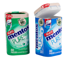
The next time you snap open a new paperboard container of Mentos mints, congratulate fellow consumers, food producers, and brand owners for driving this sustainable trend in its packaging. Perfetti van Melle, one of the world’s largest manufacturers and distributors of confectionery and chewing gum, made a commitment to environmental responsibility by launching its new Mentos PureFresh bottle produced with paperboard rather than plastic.
What made the judges bestow their Package of the Year designation? The new Boardiopaper bottle for Mentos Pure Fresh is the first product in the gum category from a major global confectioner to be delivered in a paperboard bottle. Instantly, consumers will recognize that plastic is out, and paper is in. Using a customized paperboard laminate, the package consists of more than 90% renewable fibers from sustainably managed forests replacing the previous Mentos 100% rigid plastic container. Its sidewall, top, and bottom components are converted at GPI’s state-of-the-art production facility and shipped flat saving up to 95% of storage space and transportation. In other words, one million Boardio packages need only three trucks to deliver all components to the food producer while pre-formed cans would require 56 trucks.
What’s more, this award-winner’s package strength can easily travel through distribution and retail merchandising without significant damage, minimized layers of polyethylene provide tight and safe seals for the 80 pieces of gum and its necessary shelf life, its distinct appearance is comfortable to hold, and its flip-top lid features a recessed panel to easily dispense one or a handful of pieces of gum.
Folding Carton of the Year
WestRock
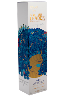
Scottish Leader Moonchild Whisky Limited Edition
Cold foil is quickly becoming the method of choice as a high-quality sustainable packaging solution. When whisky manufacturer Scottish Leader was launching its limited-edition Moonchild Whisky, it sought out a collectible package design to complement its unique flavor distilled by female master Julieann Fernandez and in partnership with South African musician Seneziwe Sanelly, best known by her stage name Moonchild Sanelly.
For this one-of-a-kind offering, WestRock put Sanelly’s profile, her distinctive blue hair, and her natural sultry demeanor front and center on the package, giving consumers a conversation starter and fun story to share with friends. While the intent was to open the brand to an entire new audience, the package needed to remain true to Scottish Leader’s bold, premium image and distinctive assets, such as the eagle, gold tab, and font. When a consumer runs their hand over the package, a tactile reticulated varnish is felt throughout the main design. Rather than use four separate hot foil passes, the designers recommended using WestRock’s FoilKote, an inline alternative to foil stamping, which not only was a sustainable solution but saved time and costs. The pops of gold throughout the design emphasize the nature of this premium whisky printed on WestRock’s PrintKote 405gsm, a high-quality, coated, solid-bleached paperboard (SBS) that delivers exceptional printability and a market-leading stiffness-to-weight ratio. Raise a glass to this award-winning package.
Rigid Box of the Year
Taylor Box Company
Red Bull Winter Edition, Premier Influencer Kit
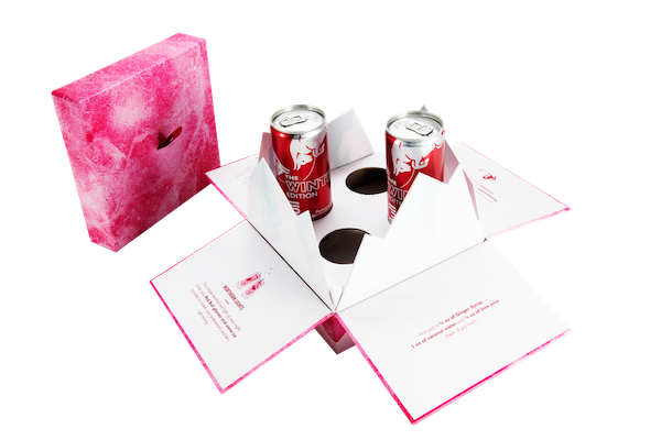
In this winning entry, it wasn’t just the Red Bull providing the buzz. Its 2021 winter edition package, produced by Taylor Box Company, required a unique eye-catching yet functional and durable design to maximize its marketing effectiveness. The goal was to transport the recipient to a snowy mountaintop to share this premium energy drink. Using the social response to the campaign as a barometer, it was a solid winner, being tagged in over a dozen Instagram and TikTok posts from athletes, bloggers, and media personalities.
What grabbed the attention of the recipients, and our judges, was the attention to detail throughout the design. Swept away in bright pink frosty hues, the outer package encourages recipients to open the box and discover its surprise gift. As the cover is lifted on the inner box, four flaps drop-down revealing two cans of pomegranate-flavored Red Bull and two branded glasses nestled within the package while jagged mountain peaks form a wall. Clever copy invites the recipient to “get mixing” and unwind with a winter mocktail.
What was most challenging for the designers was to direct the recipient to open the boxes correctly without spoiling the grand reveal. Quippy directions were printed on the panels of the outer mailer to position the inner box at the best possible angle to take in the full magic of the inside surprise. To provide durability, brightness, sustainability, and reliability, the team chose #95 C1S Text paper stock that was digitally printed with a gloss aqueous coating from Superior Binding. Our judges were impressed with the use of die-cutting, ribbon looping, and hand assembly to create the final project. In the end, the Red Bull Winter Edition proved to be a hit, giving recipients a bunch of festive winter mocktails to enjoy with friends.
Sustainability of the Year
Huhtamaki
Paperboard Yogurt Container
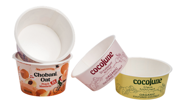
When consumers shout out a resounding “Thank You” to a food manufacturer for its newest sustainability choice, our judges take notice. That’s what Chobani and Cocojune yogurt heard when they opted to move from single-use plastic containers to renewably sourced paperboard containers. But it wasn’t the easiest of paths.
Huhtamaki’s designers needed to take into consideration many important factors. The new material had to keep the yogurt fresh, have a high standard for odor and taste neutrality, and be certified for product and hygiene management. Structurally, it needed to offer high strength at a lower basis weight to improve material efficiency; be flexible, offer strong fibers, and allow the material to be precision formed into small container shapes. They chose SBS (FSC Certified) coated paperboard.
To ensure minimal disruption to customer manufacturing processes, containers designed with dimensions similar to incumbent plastic cups. Cup rim provides consistent membrane seal area. Coated board protects the product and maintains shelf life. Using packaging made from renewable resources, supports yogurt company’s brand image of healthy food and a healthy planet.
The unique challenge that differentiates this container is an added step in the converting process; prior to cup forming, the raw edge of the paperboard blank is covered. The addition of the edge protection provides a complete barrier within the cup to prevent moisture wicking into the paperboard and shields the food product from moisture loss. To provide a surface for membrane sealing, the rim of the container uniquely coined and flattened insuring consistency. An additional sustainability advantage, during the converting process, all engineered waste from die cutting processes is collected and the fiber recycled into Chinet¬ molded fiber tableware products.
Containers nest within a stack for efficient case packing (960-1800 cups per case, depending on size/shape), with cases designed to optimize pallets and achieve cubic efficiency in the shipping container. Customers are encouraged to order in full container loads to take advantage of these efficiencies.
Judges were impressed that the new yogurt’s container reduced plastic by 80%. An added benefit: with direct print process lithography, high quality graphics can be achieved without the need for secondary labels or wraps; and bottom printing provides an additional billboard area. Now, not only are customers continuing to eat healthy, but they can make an environmentally-friendly choice in their yogurt packaging.
Innovation of the Year
Graphic Packaging International
Take Smart Fridge Beer Pack
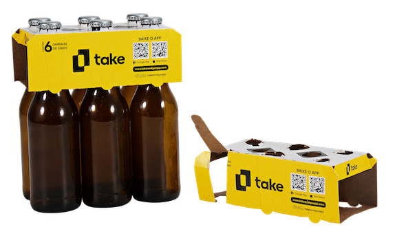
Everything about this award winner shouts innovation. When Take and Go Comercio de Bebidas Ltd, a Brazilian start-up firm, wanted to increase sales of its beer, it turned to Graphic Packaging International (GPI) for help.
To offer consumers the option of either purchasing a six-pack of beer bottles or individual bottles, it developed an app to interact with special vending machines to create an effortless shopping experience for its customers. But how would the beer be packaged? That’s where GPI came to the table.
Their innovative team developed a six-bottle clip in which the bottle tops extended through the top of the package making it easier for the Take technology to read the bottle caps and charge the customer the correct amount. Glued sleeves slide down over the neck of each bottle with small tabs encircling the top holes. This prevents the bottles from sliding out of the clip, providing a safe and secure package that can be carried by the customer with confidence. The designers also included perforations on either side so that consumers can more easily remove one bottle at a time while retaining the structural integrity of the multipack. To significantly improve efficiency to hand-load the six-packs, the designers developed a special device.
The Take 6-bottle clip is printed, cut, and glued at the plant’s state-of-the-art carton converting facility, and is shipped flat to the customers’ facility. It is printed on Klabins KlaMulti 358gsm board, which was selected for its strength, smooth print surface, and 100% recyclability, which reflects the brands’ commitment to environmental sustainability.
The new packaging has been placed in over 2,000 smart fridges in a variety of consumer businesses in its first year. The firm projects to have over 10,000 placements by 2024. The end result was consumer convenience, accelerated purchases, and higher average purchase amounts.
Digital Application of the Year
Tap Packaging + Design
Cinnamon Toast Crunch Cinnamoji Box Set
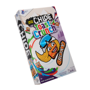 In the past decade, digital inkjet printing has moved from potential production to a proven print method. It’s no wonder that this special limited-edition project for Cinnamon Toast Crunch cereal boxes rose to the top displaying its award-winning embossing, holographic, and embellishments printed on an HP Indigo 30000 press.
To attract its young consumers, the cereal brand chose five stand-out celebrities from all walks of life: global snowboarding icon Chloe Kim, professional football star Justin Jefferson, actress and recording artist Leslie Grace, singer Manuel Turizo, and the iconic SpongeBob SquarePants to become Cinnamojis, plucky animated characters with their names and faces spray painted on the box with bright graffiti-styled colors and lettering.
With a short print run of only 10,000 boxes highlighting each celebrity, the HP Indigo 30000 press provided the speed and embellishment capability to fulfill this quick-turn project. Designers needed to decide what type of special enhancements and what type of embossing or foil to use to amplify individual aspects of each character.
To create accurate spot color reproduction, an extended gamut CMYK + orange and violet was used. The cartons were inline coated with gloss aqueous coating. Each carton received a unique set of embossing or combo stamping/embossing dies. For example, the foil stamping on the Chloe Kim box had to mimic the reflective nature of her snowboard goggle lenses, which was achieved by utilizing Light Line SB Neon TS from Kurz, a clear, neon holographic specialty foil that allows the printed graphics underneath to be visible. After the embellishments had been applied, the cartons were sent for die-cutting, stripping, and gluing processes.
Just like the gleam of Cloe Kim’s Olympic Gold Medal and her cool “off the chart” stature among young people, the cereal boxes added sizzle and notoriety for the brand. It even caught the attention of Tonight Show host Jimmy Fallon who showed his millions of viewers a box on-air with guest Cloe Kim. These coveted boxes certainly earned a gold medal in the judge’s eyes.
Richard DePaul Award for Creative Design & Converting
Graphic Packaging International
Love Cube
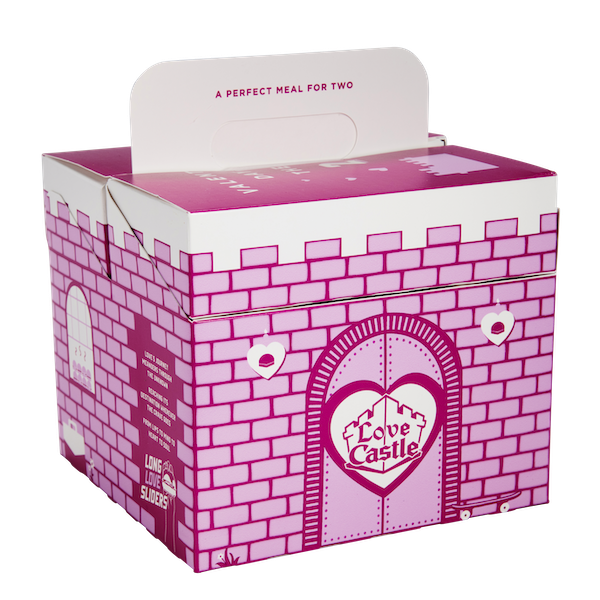
What is red, white, and aptly designed for Valentine’s Day? It’s the Love Cube, an origami-like container designed to carry out a delicious take-out meal from White Castle. Our judges found this unique structure to be an awesome marketing piece, interactive, easy to assemble, yet sturdy and recyclable.
Since 1991 when the 14th day of February rolls around, White Castle transforms its dining rooms into fine dining establishments for one day only, providing hostess seating, tableside service, and festive holiday decor. But when the pandemic forced restaurants to close for in-person dining, White Castle wore its heart on its sleeve and found a creative way to continue the celebration for a take-out only environment. Its bright pink boxes were whimsically decorated with bricks and a drawbridge to look like a castle. Adding a social media aspect to the design, consumers were invited to share their Love Cube meal photos on-line using the hashtag Love Castle.
Beyond the exterior artwork, the team had to design an easy-to-form structure for the restaurant’s employees, while keeping the food fresh and warm, and maintaining its recyclability. For over a year, the structural design team invented a combination of three separate cartons: a base carton holds eight sliders and two smaller cartons on top hold two unique side dishes, such as fries or mozzarella sticks. Designers attached the two smaller cartons to the sidewalls of the base carton to easily flip into the carton after filling.
Judges applauded the choice of 20pt Solid Bleached Sulfate (SBS) from Graphic Packaging International for its brightness, smoothness, and high-quality print surface and interior .5mil poly coating to provide grease resistance, while also contributing to its 100% recyclability and environmental sustainability. Restaurant space was also taken into consideration by designing the cartons to ship flat until they were ready to be used. It was a Valentine gift that everyone coveted.
Judges’ Award
RRD
Greenleaf Home Fragrance Folding Cartons
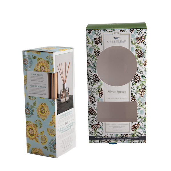
Purchasing a fine fragrance can be as challenging as choosing a rare piece of artwork. The Grace Management Group, a leading home fragrance manufacturer, discovered its own solution. The firm’s popular Greenleaf candle and diffuser product lines are packaged using elegant graphics reproduced from artist paintings, allowing consumers to select the home fragrance that best fits their personal décor. Judges deemed their folding cartons as award winners for delivering an aesthetic feel that enhances the fragrance experience.
When the Spartanburg, S.C. client stressed the need for a local vendor in the Carolinas to reduce production time and costs yet one who could deliver critical color management, RRD Packaging Solutions was chosen and turned to its HP digital press production line. Grace wanted to ensure that each of its packages offered the richness and crisp color match found on the store shelf. RRD was called upon to print quantities up to 5,000 per SKU with approximately 10 to 12 SKUs per product line.
Structural design was an important component as well. After producing a variety of samples, designers chose 20pt C1S Spectro board white for the best print and protection of the product. The glass and reed diffusers required special strong housing along with a reinforced tuck flap on the bottom to protect the product, with RRD’s folding and gluing equipment finishing the print job in one pass. Cartons are then packed flat by version, labeled, and skid packed to ship to the client. Today, these beautifully printed products are changed seasonally with approximately a dozen fragrance options, giving consumers an award-winning package and fragrance.
Judges’ Award
TPC Printing & Packaging
Honey Wild Flower
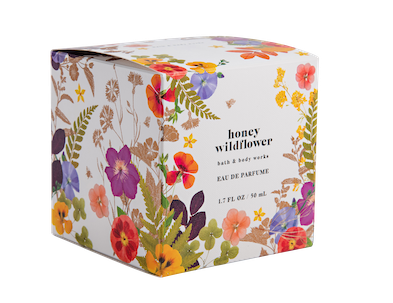
Fragrance packaging is renowned for its rich, expensive details to draw a consumer to purchase its particular scent. The makers of Honey Wildflower, a fresh new fragrance, knew they had to design an outstanding box to set it apart from the competition. The goal was for a consumer to be drawn to a dazzling display of brightly-colored wildflowers, ferns, and clover glowing in the bright summer sunshine.
To get the most impressive look, TPC’s packaging designers turned to a Scodix digital enhancement printing press, which brings a wide range of embellishment choices and adds impact to the printed product with foil, glitter, metallic, braille, spot UV, and cast-and-cure embellishments. The field of honey wildflowers and leaves, printed on Clearwater .018 SBS for surface quality and brightness, was enhanced against the textured emboss pattern using the Scodix polymer application. Judges looked closely at the special coating and cold foiling used. Perfectly registered cold foil of the copper tones and leaf dropouts created a natural and appealing feel. Another winning feature was how perfectly registered each application is to the image—the serrated tips of the leaves and the foiling on the small honeybee flying high on the face panel were created by silver cold foil overprinted by copper ink. Since its launch, the box, and its fragrance, have become huge hits with consumers.
Paperboard Packaging Competition Magazine
